There are a wealth of ways to correct contrast in a photo. Many of these methods will adjust the contrast in the overall photo and not be specific to any region (mid tones for example). The reason why you will often want to only increase contrast in the mid tones is that the blacks are already black and the whites are white. So increasing the contrast can affect these areas which are already where they should be.
Here is a method for increasing the contrast in the mid tones without affecting colors in the photo and the areas where we don't want contrast to be increased.
Starting with a photo like this one:

It isn't necessarily bad or wrong in anyway. But let's just go for it and see what changing the contrast in the mid tones will do for this one.
To do this we will use a curves adjustment layer. You could apply the changes directly to the photo layer but in doing so you would loose the ability to adjust the effect independently later (fade, blend etc.).
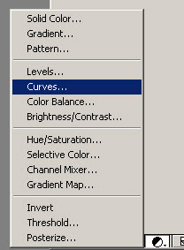
From the layers palette - add adjustment layer select Curves.

The curves dialog doesn't have curves in it at all when it pops up. How disappointing ;-)
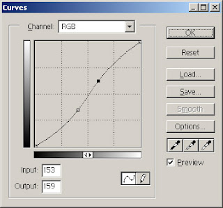
Next step is to add to points/handles as illustrated in the screen shot below. The area between the handles is where the mid tones reside and these are the ones we want to affect by increasing the contrast.

In the curves dialog it's relatively easy to increase the contrast for a given section. The steeper the line is between two points the greater the contrast is in the photo.
So increase the contrast in the mid tones simply by moving the right point/handle towards the top and the left point/handle towards the bottom.
You will get an instant preview in your photo which you can use to guide you in regards to how much you should move each point/handle.
I know it's difficult but for now don't worry about colors.
The curve should end up in a "S" like shape like illustrated below.

Remember me mentioning not to worry about colors for now?
Well take this photo as an example and you will see that the colors have been affected very much. They are over saturated and it is just a bit too much.

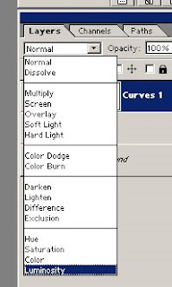
But as I said don't worry. This is very easy to "fix". Select the curves adjustment layer in the layer window and change the blend mode to Luminosity using the drop-down as shown here:

Now here is the finished result. Didn't take to many shapes but as you can see it's like some clarity has been added but this simple trick :-)
 |  |
ohh btw. to really see the difference click the photos to see a large version.
No comments:
Post a Comment