Having a DSLR I have been trying to get the best quality in photos and create a semi-pro workflow. I know it sounds fanzy and complicated but once a workflow is established then all you have to do is take the photos, import and print the ones you like.
My initial, second, third... (well you get the idea) attempts has been that once I import the photos in lightroom they kind of loose a bit of the contrast and saturation compared to how they looked on the LCD.
Of course this is caused by the RAW format conversion and the Nikon Raw (NEF) format is proprietary and not something that is publicly shared. So importing to lightroom or opening in photoshop the file have to be converted and the automatic conversion rarely comes out the way you want it.
Recently (as I was looking for a web plugin for lightroom) I stumbled on a raw conversion plugin from Adobe.
The DNG profiles which have camera profiles for just about any DSLR can be downloaded for FREE from Adobe.
After download just close all programs on your computer. Run the program (install camera profiles) and startup lightroom/photoshop and you are ready to go.
Now you can manually change the module used for converting the raw files or create a preset with the adjustment...
I have done only a few tests and so far it works pretty good. It doesn't seem like any adjustments are needed after import (using a preset setting the camera format to the camera standard).
Anyway, I'm sure more will come later but hey go ahead and try it out :-)
Resources:
Camera profiles + profile editor: http://labs.adobe.com/wiki/index.php/DNG_Profiles
Cool lightroom presets: http://cameradojo.com/lightroom-presets/
Saturday, October 18, 2008
Saturday, September 13, 2008
Lomography or "the cheap shot"
Lomography is the commercial trademark of Lomographische AG, Austria. However the lomo type of photography is inspired by the former state-run optics manufacturer LOMO PLC of Saint Petersburg, Russia. LOMO PLC created and produced the 35 mm LOMO LC-A compact Automat camera which is the center of this particular style of photography.
If you want to read more of the history check it out here or why not buy a lomo camera here.
Most likely everyone have heard the slogan originating from Kodak "a Kodak moment". Well guess what. The producers of the lomo got one too... "Don't think about it". This is based on the camera being rather cheap and all you have to do is press the button. No fanzy settings or stuff like that. Just point the camera and press the button. Don't think about it ;-) kind of like that...
Here is a little tutorial on taking a photo and turning it into a Lomo version or "cheap" shot.
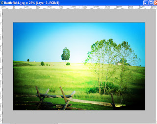
Start out by selecting a photo and opening it in photoshop.
Here is the one I picked to work with.
First steps are to increase contrast and saturation.
Starting out with contrast select Brightness/Contrast from the add adjustment layer button in the layer pane. Once in the dialog set the contrast value to 20 and press ok to add the layer.
Next for saturation. Select Hue/Saturation from the add adjustment layer button in the layers pane. Once in the dialog set the saturation to 20 and click ok to add the layer.
Next we are going to create a typical vignette as in a typical lomo photo.
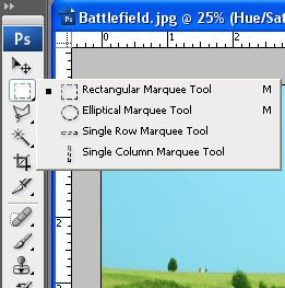
Start out by selecting the elliptical marquee tool from the toolbox. If this is not immediately visible right click with the mouse on the selection tool to expand the menu.
To get the vignette just right and fade out as we want it a feathering has to be applied to the selection. In this case I will use a feathering that is about a tenth of the photos shortest edge.
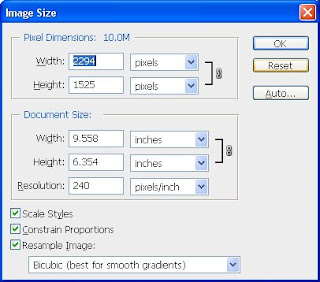
To find the size of your image select image size from the image menu. In my example the shortest edge is 1525 pixels so I will be using a feathering of 152.
Once the elliptical marquee tool is selected you can set the feathering in the options bar at the top of the screen.
Use the marquee tool to select the center of your image. Do this by placing the cursor in one corner of the image. Hold down left mouse button and drag the selection to the opposite corner.
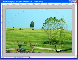
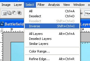
Now the center of the image is selected but that is not *really* what we wanted. Actually we wanted just the opposite but that's ok. Just use inverse from the select menu or use the keyboard Shift+Ctrl+i to inverse the selection.
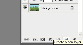
Create a new layer for the vignette using the new layer button in the layers pane.
From the Edit menu select Fill and choose black as the contents and click ok.
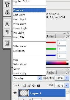
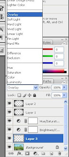
Now the vignette looks sort of ok but to make it look more realistic and blend in with the photo select overlay from the blending dropdown in the layer pane.
Depending on how the vignette looks you can copy the layer (Ctrl+j) to increase or lower the opacity to decrease the effect of the vignette. Here I copied the vignette to strengthen it a bit.

Now select the photo layer (background) and create a new layer (will be inserted directly above the background layer).
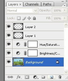
Change this layers blend mode to opacity the same way as the vignette.
Check to make sure your foreground color is white. If not select default colors in the toolbox (shortcut d) and switch the color (shortcut x) to make white the foreground color.
From the toolbox select the gradient fill. If it's not immediately visible in the toolbox you can right click with the mouse on the paint bucket to show the menu.
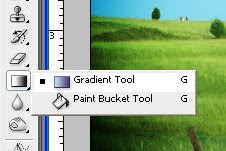
With the gradient fill tool selected you can now select radial gradient from the options bar. Clicking the drop down arrow next to the style select the foreground to transparent type. Note if your foreground color is anything but white this is the color that will show up here too so make sure you set the right color ;-)
If the vignette is still selected deselect it using the deselect from the select menu or using the Ctrl+D shortcut.
With the gradient tool click in the middle of the photo and drag the line to any of the edges.
If the result seems a bit too much you can lower the effect by lowering the opacity of the layer. It should be bright but not a shining white center.
And there you have your finished Lomo photo with strong contrast, saturation and vignette. I kind of like the saturation in these photos and it just seems so straight forward that it is hard to believe :-)
Ohh yeah if your photo needs adjustments, and may I add that's exactly why we are using adjustment layers, you can adjust the vignette by copying a vignette layer to make it stronger or adjust the opacity of the topmost vignette layer to lessen it and you can adjust the layer above the background layer to control the brightness of the photo.
A couple of extra shots
Here is a couple of extra shots I applied the effect to.
Have fun and ... don't think about it ;-)
Additional information
http://www.lomo.com/
http://www.lomographic.net/.
http://williamburdette.net/lomography/
If you want to read more of the history check it out here or why not buy a lomo camera here.
Most likely everyone have heard the slogan originating from Kodak "a Kodak moment". Well guess what. The producers of the lomo got one too... "Don't think about it". This is based on the camera being rather cheap and all you have to do is press the button. No fanzy settings or stuff like that. Just point the camera and press the button. Don't think about it ;-) kind of like that...
Here is a little tutorial on taking a photo and turning it into a Lomo version or "cheap" shot.
Start out by selecting a photo and opening it in photoshop.
Here is the one I picked to work with.

First steps are to increase contrast and saturation.
Starting out with contrast select Brightness/Contrast from the add adjustment layer button in the layer pane. Once in the dialog set the contrast value to 20 and press ok to add the layer.
 |  |
Next for saturation. Select Hue/Saturation from the add adjustment layer button in the layers pane. Once in the dialog set the saturation to 20 and click ok to add the layer.
 |  |
Next we are going to create a typical vignette as in a typical lomo photo.
Start out by selecting the elliptical marquee tool from the toolbox. If this is not immediately visible right click with the mouse on the selection tool to expand the menu.

To get the vignette just right and fade out as we want it a feathering has to be applied to the selection. In this case I will use a feathering that is about a tenth of the photos shortest edge.
To find the size of your image select image size from the image menu. In my example the shortest edge is 1525 pixels so I will be using a feathering of 152.

Once the elliptical marquee tool is selected you can set the feathering in the options bar at the top of the screen.

Use the marquee tool to select the center of your image. Do this by placing the cursor in one corner of the image. Hold down left mouse button and drag the selection to the opposite corner.

Now the center of the image is selected but that is not *really* what we wanted. Actually we wanted just the opposite but that's ok. Just use inverse from the select menu or use the keyboard Shift+Ctrl+i to inverse the selection.

Create a new layer for the vignette using the new layer button in the layers pane.

From the Edit menu select Fill and choose black as the contents and click ok.
 |  |
Now the vignette looks sort of ok but to make it look more realistic and blend in with the photo select overlay from the blending dropdown in the layer pane.

Depending on how the vignette looks you can copy the layer (Ctrl+j) to increase or lower the opacity to decrease the effect of the vignette. Here I copied the vignette to strengthen it a bit.

Now select the photo layer (background) and create a new layer (will be inserted directly above the background layer).

Change this layers blend mode to opacity the same way as the vignette.

Check to make sure your foreground color is white. If not select default colors in the toolbox (shortcut d) and switch the color (shortcut x) to make white the foreground color.
From the toolbox select the gradient fill. If it's not immediately visible in the toolbox you can right click with the mouse on the paint bucket to show the menu.

With the gradient fill tool selected you can now select radial gradient from the options bar. Clicking the drop down arrow next to the style select the foreground to transparent type. Note if your foreground color is anything but white this is the color that will show up here too so make sure you set the right color ;-)
 |  |
If the vignette is still selected deselect it using the deselect from the select menu or using the Ctrl+D shortcut.
With the gradient tool click in the middle of the photo and drag the line to any of the edges.

If the result seems a bit too much you can lower the effect by lowering the opacity of the layer. It should be bright but not a shining white center.

And there you have your finished Lomo photo with strong contrast, saturation and vignette. I kind of like the saturation in these photos and it just seems so straight forward that it is hard to believe :-)
Ohh yeah if your photo needs adjustments, and may I add that's exactly why we are using adjustment layers, you can adjust the vignette by copying a vignette layer to make it stronger or adjust the opacity of the topmost vignette layer to lessen it and you can adjust the layer above the background layer to control the brightness of the photo.
|  |
A couple of extra shots
Here is a couple of extra shots I applied the effect to.
 |  |
Have fun and ... don't think about it ;-)
Additional information
http://www.lomo.com/
http://www.lomographic.net/.
http://williamburdette.net/lomography/
Tuesday, July 1, 2008
Photos of smoke - post processing
More in this series:
- Photos of smoke studio setup and lighting
- Photos of smoke photo exhibit
Soo now you got a ton of smoke photos and they are all black and color less.
Here is the post processing step following the light setup and capture of the photos and this is where we do some modifications to the photos and make them stand out.
It hopefully is pretty easy to follow but otherwise just let me know and please ask if you got questions. I will make sure to get everything answered :-)
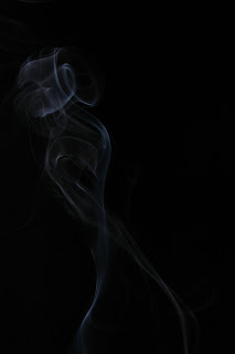
Here is a photo I will be using for the creation of a smoke photo or art smoke if you will :-)
The foundation
The first important thing to make sure of is that the background is black. Not just as in a pretty dark background but technically black with the RGB values 0, 0, 0.
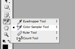
To do this we need some reference points in the photo and those can be set using the color sampler (or just use the eye dropper and ctrl click instead of clicking).
In the toolbar locate the color sampler. It may be hidden but will be shown if you right click on the eye dropper.
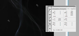
Click on a couple of what should be black areas in the photo and notice how you now have the values for those points in info panel in the upper right hand corner. As I suspected there is a little hint (very little) as the RGB values are not 0,0,0 for the points I selected.
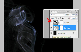
To adjust the tones in the photo add a curves adjustment layer either using the layers menu or click the half white, half black circle in the layers palette.
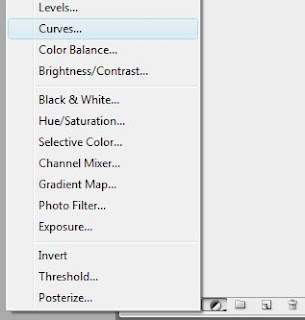
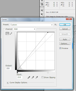
In the curves dialog click the lower left point and either use the arrow keys to tap the point right or use the mouse to drag it towards the right. It may be a little tricky but the goal here is to have the color sample values in the info panel go to the desired values of 0,0,0. Once completed you can brighten the smoke a little bit by selecting the point in the upper right hand corner and move it towards the left (using arrow keys or the mouse).
Now the photo should have the background black and the smoke standing out in white/gray tones.
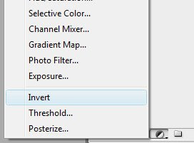
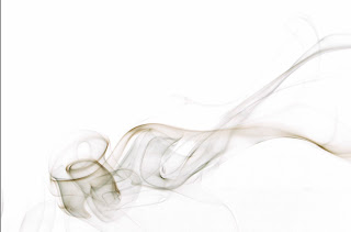
Some smoke art photos don't have a black background but is presented as colorful waves on white. First step is to turn the background white which is easily done by inverting the photo. To do this and maintain flexibility add a invert adjustment layer from the layers menu or using the add adjustment layer button in the layers palette.
This will instantly turn the background white and the smoke comes out as dark on white instead of light on black. At this point you may want to make the smoke stand out a bit more by increasing the contrast. You can do this by moving the white point in the existing curves layer.
Double click on the curve icon in the layers palette and in the curves dialog box drag the white point (upper right hand corner or where ever you left it) more towards the left. This will increase the contrast and make the smoke stand out.
Now for a really neat trick and the reason why we are using adjustment layers instead of altering the photo.
Click the eye (effectively hiding the layer) next to the invert layer. Now you have white smoke on a black background. Clicking again will show the invert layer and you have black smoke on a white background. This is great to determine what looks best for your particular design.
Another factor when making smoke art is that smoke rises so most of your photos will reflect that fact. However sometimes wonderful things happen when you turn things sideways or even upside down. All of this can easily be done using the rotate canvas functions in the image menu.
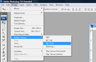
For this one I decided to turn it side ways and well hmm that's an artistic decision soo... deal with it ;-)
Adding colors
Colors can be added to the smoke in different ways and no one way is the right or wrong way so try a couple of different ways and see what works best for you and your photos.
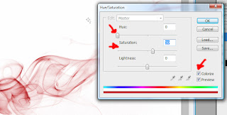
First up adding colors using a hue/saturation adjustment layer.
Add the adjustment layer by selecting it from the add adjustment layer menu in the layers palette.
First set a check mark in the colorize check box which tells photoshop that we want to add colors to the photo. Now you can easily adjust the color of the smoke and the intensity of the color by moving the handles in the dialog.
The really really neat thing is that since we made sure the background was technically black this isn't affected at all by the application of color :-)
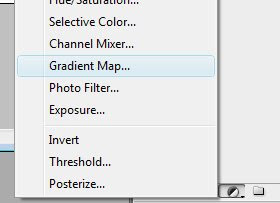
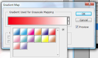
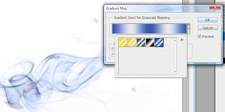
Another option for adding color to the smoke is using a gradient map adjustment layer. Like the hue/saturation add the layer by selecting gradient map from the add adjustment layer menu in the layers palette.
Here you can select a gradient map that will fit your smoke photo even though selecting one of them can be a little tricky :-(
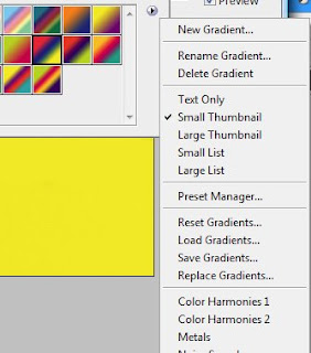
Depending on what you have loaded in the gradient map dialog you may see different gradient maps. To load a different set of gradient maps click the little arrow in the white round thingi ma bop in the dialogs upper right hand corner and select a different collection from the menu (at the bottom section).
Now selecting a gradient map will affect everything in the photo and can make it a bit weird. I know you can modify and even create your own gradient map but let's just keep it simple :-)
Click ok in the gradient map dialog to close it and change the gradient maps layer blend mode to color.
Now double click the half white, half black circle in the gradient map layer to reopen the dialog.
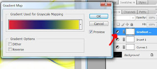
Once back in the gradient map dialog you can preview the map as you are selecting it.
A third way of coloring the smoke is to well just color it :-) I know I know...
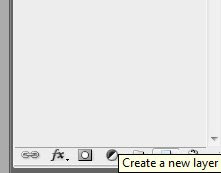
Start by adding a empty layer to the layer stack clicking the new layer button in the layers palette.
Before doing anything else. Select the new layer and change the blend mode to color.
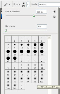
Select a soft brush (one of the fuzzy ones in the brush tip selector found in the top toolbar).
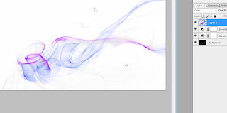
Pick a color and (after ensuring the new layer is the active in the layers palette) start painting on top of your smoke. Once again since the blend mode is set to color the white background isn't affected by the color.
For this one I selected a purple brush to color the edges and a blue for the rest.
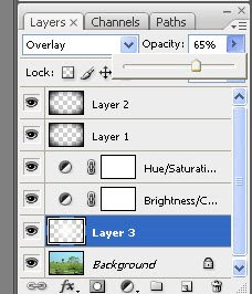
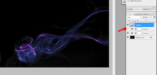
Look what happens when I disable the invert adjustment layer (hide the layer by clicking the eye). On this one my coloring came out a bit too strong but I selected the coloring layer and lowered the opacity to 65% which lessened the effect.
More in this series:
- Photos of smoke studio setup and lighting
- Photos of smoke photo exhibit
- Photos of smoke studio setup and lighting
- Photos of smoke photo exhibit
Soo now you got a ton of smoke photos and they are all black and color less.
Here is the post processing step following the light setup and capture of the photos and this is where we do some modifications to the photos and make them stand out.
It hopefully is pretty easy to follow but otherwise just let me know and please ask if you got questions. I will make sure to get everything answered :-)
Here is a photo I will be using for the creation of a smoke photo or art smoke if you will :-)

The foundation
The first important thing to make sure of is that the background is black. Not just as in a pretty dark background but technically black with the RGB values 0, 0, 0.
To do this we need some reference points in the photo and those can be set using the color sampler (or just use the eye dropper and ctrl click instead of clicking).
In the toolbar locate the color sampler. It may be hidden but will be shown if you right click on the eye dropper.

Click on a couple of what should be black areas in the photo and notice how you now have the values for those points in info panel in the upper right hand corner. As I suspected there is a little hint (very little) as the RGB values are not 0,0,0 for the points I selected.

To adjust the tones in the photo add a curves adjustment layer either using the layers menu or click the half white, half black circle in the layers palette.

In the curves dialog click the lower left point and either use the arrow keys to tap the point right or use the mouse to drag it towards the right. It may be a little tricky but the goal here is to have the color sample values in the info panel go to the desired values of 0,0,0. Once completed you can brighten the smoke a little bit by selecting the point in the upper right hand corner and move it towards the left (using arrow keys or the mouse).

Now the photo should have the background black and the smoke standing out in white/gray tones.
Some smoke art photos don't have a black background but is presented as colorful waves on white. First step is to turn the background white which is easily done by inverting the photo. To do this and maintain flexibility add a invert adjustment layer from the layers menu or using the add adjustment layer button in the layers palette.

This will instantly turn the background white and the smoke comes out as dark on white instead of light on black. At this point you may want to make the smoke stand out a bit more by increasing the contrast. You can do this by moving the white point in the existing curves layer.
Double click on the curve icon in the layers palette and in the curves dialog box drag the white point (upper right hand corner or where ever you left it) more towards the left. This will increase the contrast and make the smoke stand out.

Now for a really neat trick and the reason why we are using adjustment layers instead of altering the photo.
Click the eye (effectively hiding the layer) next to the invert layer. Now you have white smoke on a black background. Clicking again will show the invert layer and you have black smoke on a white background. This is great to determine what looks best for your particular design.

Another factor when making smoke art is that smoke rises so most of your photos will reflect that fact. However sometimes wonderful things happen when you turn things sideways or even upside down. All of this can easily be done using the rotate canvas functions in the image menu.

For this one I decided to turn it side ways and well hmm that's an artistic decision soo... deal with it ;-)

Adding colors
Colors can be added to the smoke in different ways and no one way is the right or wrong way so try a couple of different ways and see what works best for you and your photos.
First up adding colors using a hue/saturation adjustment layer.
Add the adjustment layer by selecting it from the add adjustment layer menu in the layers palette.

First set a check mark in the colorize check box which tells photoshop that we want to add colors to the photo. Now you can easily adjust the color of the smoke and the intensity of the color by moving the handles in the dialog.
The really really neat thing is that since we made sure the background was technically black this isn't affected at all by the application of color :-)

Another option for adding color to the smoke is using a gradient map adjustment layer. Like the hue/saturation add the layer by selecting gradient map from the add adjustment layer menu in the layers palette.

Here you can select a gradient map that will fit your smoke photo even though selecting one of them can be a little tricky :-(

Depending on what you have loaded in the gradient map dialog you may see different gradient maps. To load a different set of gradient maps click the little arrow in the white round thingi ma bop in the dialogs upper right hand corner and select a different collection from the menu (at the bottom section).

Now selecting a gradient map will affect everything in the photo and can make it a bit weird. I know you can modify and even create your own gradient map but let's just keep it simple :-)
Click ok in the gradient map dialog to close it and change the gradient maps layer blend mode to color.

Now double click the half white, half black circle in the gradient map layer to reopen the dialog.

Once back in the gradient map dialog you can preview the map as you are selecting it.

A third way of coloring the smoke is to well just color it :-) I know I know...
Start by adding a empty layer to the layer stack clicking the new layer button in the layers palette.

Before doing anything else. Select the new layer and change the blend mode to color.

Select a soft brush (one of the fuzzy ones in the brush tip selector found in the top toolbar).

Pick a color and (after ensuring the new layer is the active in the layers palette) start painting on top of your smoke. Once again since the blend mode is set to color the white background isn't affected by the color.
For this one I selected a purple brush to color the edges and a blue for the rest.

Look what happens when I disable the invert adjustment layer (hide the layer by clicking the eye). On this one my coloring came out a bit too strong but I selected the coloring layer and lowered the opacity to 65% which lessened the effect.

More in this series:
- Photos of smoke studio setup and lighting
- Photos of smoke photo exhibit
Friday, June 6, 2008
Increase contrast
Often when taking photos with digital cameras you will notice that the contrast in the mid tones isn't quite where it should be. Or well you may see it as looking a little flat or maybe you won't even notice until you see the same photo with the contrast where it should be.
There are a wealth of ways to correct contrast in a photo. Many of these methods will adjust the contrast in the overall photo and not be specific to any region (mid tones for example). The reason why you will often want to only increase contrast in the mid tones is that the blacks are already black and the whites are white. So increasing the contrast can affect these areas which are already where they should be.
Here is a method for increasing the contrast in the mid tones without affecting colors in the photo and the areas where we don't want contrast to be increased.
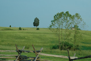
Starting with a photo like this one:
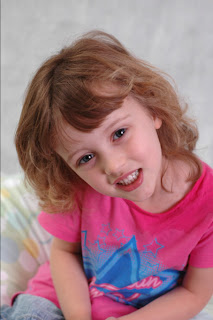
It isn't necessarily bad or wrong in anyway. But let's just go for it and see what changing the contrast in the mid tones will do for this one.
To do this we will use a curves adjustment layer. You could apply the changes directly to the photo layer but in doing so you would loose the ability to adjust the effect independently later (fade, blend etc.).
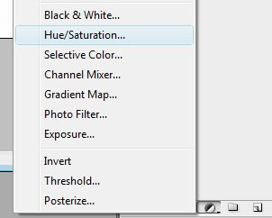
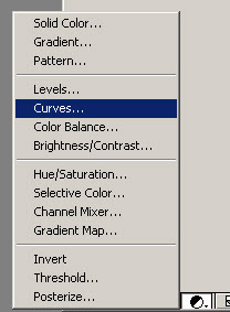
From the layers palette - add adjustment layer select Curves.
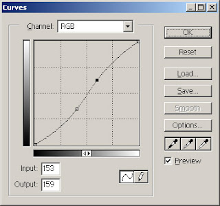
The curves dialog doesn't have curves in it at all when it pops up. How disappointing ;-)
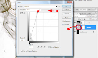
Next step is to add to points/handles as illustrated in the screen shot below. The area between the handles is where the mid tones reside and these are the ones we want to affect by increasing the contrast.

In the curves dialog it's relatively easy to increase the contrast for a given section. The steeper the line is between two points the greater the contrast is in the photo.
So increase the contrast in the mid tones simply by moving the right point/handle towards the top and the left point/handle towards the bottom.
You will get an instant preview in your photo which you can use to guide you in regards to how much you should move each point/handle.
I know it's difficult but for now don't worry about colors.
The curve should end up in a "S" like shape like illustrated below.
Remember me mentioning not to worry about colors for now?
Well take this photo as an example and you will see that the colors have been affected very much. They are over saturated and it is just a bit too much.
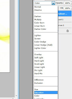
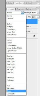
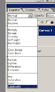
But as I said don't worry. This is very easy to "fix". Select the curves adjustment layer in the layer window and change the blend mode to Luminosity using the drop-down as shown here:
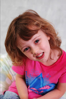
Now here is the finished result. Didn't take to many shapes but as you can see it's like some clarity has been added but this simple trick :-)
ohh btw. to really see the difference click the photos to see a large version.
There are a wealth of ways to correct contrast in a photo. Many of these methods will adjust the contrast in the overall photo and not be specific to any region (mid tones for example). The reason why you will often want to only increase contrast in the mid tones is that the blacks are already black and the whites are white. So increasing the contrast can affect these areas which are already where they should be.
Here is a method for increasing the contrast in the mid tones without affecting colors in the photo and the areas where we don't want contrast to be increased.
Starting with a photo like this one:

It isn't necessarily bad or wrong in anyway. But let's just go for it and see what changing the contrast in the mid tones will do for this one.
To do this we will use a curves adjustment layer. You could apply the changes directly to the photo layer but in doing so you would loose the ability to adjust the effect independently later (fade, blend etc.).
From the layers palette - add adjustment layer select Curves.

The curves dialog doesn't have curves in it at all when it pops up. How disappointing ;-)
Next step is to add to points/handles as illustrated in the screen shot below. The area between the handles is where the mid tones reside and these are the ones we want to affect by increasing the contrast.

In the curves dialog it's relatively easy to increase the contrast for a given section. The steeper the line is between two points the greater the contrast is in the photo.
So increase the contrast in the mid tones simply by moving the right point/handle towards the top and the left point/handle towards the bottom.
You will get an instant preview in your photo which you can use to guide you in regards to how much you should move each point/handle.
I know it's difficult but for now don't worry about colors.
The curve should end up in a "S" like shape like illustrated below.

Remember me mentioning not to worry about colors for now?
Well take this photo as an example and you will see that the colors have been affected very much. They are over saturated and it is just a bit too much.

But as I said don't worry. This is very easy to "fix". Select the curves adjustment layer in the layer window and change the blend mode to Luminosity using the drop-down as shown here:

Now here is the finished result. Didn't take to many shapes but as you can see it's like some clarity has been added but this simple trick :-)
|  |
ohh btw. to really see the difference click the photos to see a large version.
Subscribe to:
Posts (Atom)